Peckham workshop
Artist // Natalie Perkins // redhotperker@gmail.com


Peckham workshop
Artist // Natalie Perkins // redhotperker@gmail.com
As I started the design journey for Hoard, I found myself caught by the challenge of creating a space that would capture the essence of a child's perspective. How could I transport viewers into Maria's world, allowing them to see through the eyes of a 6-year-old? I discovered the power of color. I chose a vibrant teal hue as the cornerstone of my design, applying it across the entire set. This bold choice served a dual purpose: it not only created a cohesive backdrop but also helped to immerse the audience in Maria's unique point of view.
By painting the wooden panels teal all the way around the room, I crafted a landscape that transformed the space into Marias playground
When I first saw this particular teal on an image Luna and I were sharing, I immediately visualized Maria's world - slightly mysterious, but safe and exciting.
But how could I balance the need for authenticity with the playful spirit of a 6 year old? The key was in the details. While Mother may have created what adults would perceive as a mess, I wanted to reframe it through Maria's eyes as an exciting, fun-filled environment. ( Stacked book staircase, birdcages, piano with a lit roof scape )
The teal backdrop became a canvas for imagination, allowing the hoard to take on new life.
As I stepped back, I wondered whether I successfully bridged the gap between authentic set design and the whimsical world of childhood? The room seemed to pulse with energy,
It was a delicate balance, but one that I hoped would resonate with audiences and transport them into Maria's vibrant, teal-tinted reality.
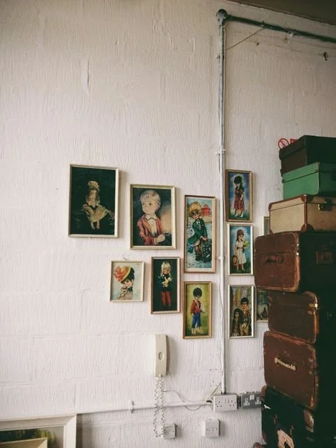
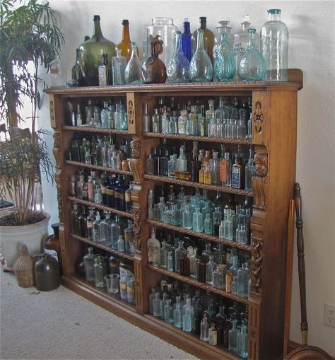
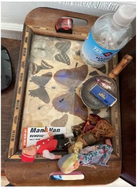
Ahead of Hoard arriving in cinemas next month I wanted to touch on some of the objects that entered the chaos of Marias houses. We wanted each prop to be part of the 'catalogue of love'. I wanted to make sure each item was dressed in the set as if the found item was going to last forever. Of course they all didn't but Luna let them echo for a bit. Some things mirrored Marias mums mindset others were an expression of love and longing. We also had to get period appropriate found objects as the Hoard was set in the early 80s.
Here are a few references for this element of the film, personal photos that Luna kindly let me in on and some objects that made the set.
One of my favourite finds were a collection of glass bottles we later used to dress into a ceiling installation. Our Art Dept assistant Joshua Books found these in a ditch somewhere over a fence near home.
In another post I will talk about how the texture of the things we sourced were just as important to the lighting to create the right atmosphere.


Bobbie Cousins Studio x The Set Pistols https://www.facebook.com/thesetpistols/?locale=en_GB |

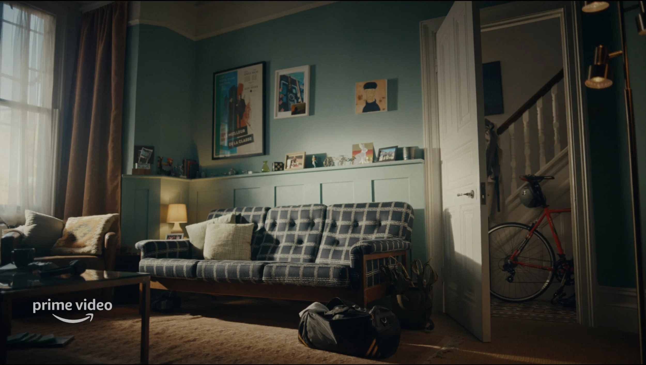
Recently I was asked to design and build a set for Thierry Henry and Amazon for French tv. I commissioned Paul Muller to make a film poster to fit into the raised set. Apart from using Paul to create a copyright free image, this poster needed to be a subject of art that sat in a mans living room. I was in awe by his skill in getting the essence of a Godard film poster without it ever being one. Bravo

I like to work with paint, paintings and painters, I like the style. If the image is visible then I need to consider how it is produced for my set.
With A.I generated images it is possible to create something close to what I want but am I not ready for a full takeover. Shown here are 2 different examples in adverts I designed for Amazon Prime. The first two are commissioned pieces of art ( able to hire at KLART), hand painted and bespoke to this room. The other is a generated image of a subject with the desired brush stroke and colour, the art dept enhanced the image to feel like a full painted image.
At the moment this is the meeting point I like to use between A.I and the painter/illustrator.

A collaboration between English National Ballet and Vampires Wife, where we made something quite beautiful and timeless. The curtain is the stage set to be used by the Iconic brand to showcase their dresses and for hopefully many seasons to come. It was important to Susie Cave to have something pink as a backdrop to the Ballet dancers and with this in mind we chose an elegant Habotai Silk to work it’s magic.
Thanks to Fiona Crombie and Peter Knowles for getting me on board.
I like to try and keep the colours flowing though a video. It’s not always possible but it could just take a quick chat with costume dept. to help the overall design work and in this case stay authentic.

…Whilst working.
Jon Hopkins has that atmospheric spacious music that helps me concentrate. His handmade sounds add the visceral element to his electronic music. My understanding about Electronic music shifted after visiting the Design Museums exhibition- Electronic music: From Kraftwerk to Chemical Brothers. Putting things in a gallery setting makes the genre understood for sure, though for me the sound shows hope for the future. The way electronic artists use light and set design to create a feeling is unreal!
When discussing with the Saam Farahmand ( Director ) and client, I first engaged with a palette and materials for us all to understand the direction of commercial. In this instance I found it best to look at living qualities to help bring the sets alive. Here are initial 3 boards taken as conversation starters and a photograph taken on my Samsung whilst on the recce.


A recent trip during lockdown to Somers Town, Euston, allowed me to scratch up on my sketching skills. I am interested in the immediacy of translating something to paper. Later, these sketches can be refined using photographs.
I hoped to have demonstrated how we create a strong sense of Mari ' The Artist' with this board. The interiors I referenced were way earlier than the period we are looking at, but I think they serves as a good reference in terms of a creative space or the home of an artist. The Bloomsbury group embraced colour, pattern, print and also textiles. I think that given the age of the location, its not a bad thing to be looking to some older references like this, whilst still making sure it doesn’t look overly period, or TOO ARTY!


Location recce, Corfu, Greece. A post war abonded house. A treasure find for our 1970 period. We spent a day with the mayor of the village, exploring locations and understanding what’s available for our Art dept. Here i noticed that people live with a lot less and take pride in what’s available to them. Seeing someone beat the dust out a rug was a good example. I’m interested how people live in small places.


Working in a central location like here in Coventry town centre, it takes constant conversations with all the crew, council and the public. For the final parade of the film the build had to be installed and taken down in 3 days. With quick rigging amazing model makers and wet weather clothes it was a smooth operation..


Using Adobe Photoshop is one of the best tools when collecting ideas and building a set…It could be a poster, scaling an object, or collaging for references, I always find it a useful method when visualising an idea and drawing a set.

Charlotte in Rehearsals
Here is a series of photoshop edits our graphic designer made for the film MARI before selecting the one that would feature in the film..

60% of my research is from books...
Usually Amazon, galleries I visit and book shops tucked away in the west end. They all provide the resources and information I need for initial research. I refer to these books from the start through to the end of a project.
Here are a few of my most recent…